GridPlot
GridPlot class will help you very easily display any Grid.
Note
Dedicated software like VESTA might be faster in rendering big 3D grids, but the strength of this plot class lies in its great flexibility, tunability (change settings as you wish to customize the display from python) and convenience (no need to open another software, you can see the grid directly in your notebook). Also, you can combine your grid plots however you want with the other plot classes in the framework.
[1]:
import sisl
import numpy as np
# This is just for convenience to retreive files
siesta_files = (
sisl._environ.get_environ_variable("SISL_FILES_TESTS") / "sisl" / "io" / "siesta"
)
info:0: SislInfo: Please install tqdm (pip install tqdm) for better looking progress bars
The first thing that we need to do to plot a grid is having a grid, so let’s get one!
In this case, we are going to use an electronic density grid from a .RHO file in SIESTA. There are multiple ways of getting the plot:
[2]:
rho_file = siesta_files / "SrTiO3.RHO"
# From a sisl grid, you can do grid.plot()
grid = sisl.get_sile(rho_file).read_grid()
plot = grid.plot()
# All siles that implement read_grid can also be directly plotted
plot = sisl.get_sile(rho_file).plot.grid()
Anyway, you will end up having the grid under plot.grid.
Let’s see what we’ve got:
[3]:
plot
_ipython_canary_method_should_not_exist_ False
_ipython_display_ True
Well, this doesn’t look much like a grid, does it? By default, GridPlot only shows the third axis of the grid, while reducing along the others. This is because 3D representations can be quite heavy depending on the computer you are in, and it’s better to be safe :)
Plotting in 3D, 2D and 1D
Much like GeometryPlot, you can select the axes of the grid that you want to display. In this case, the other axes will be reduced.
For example, if we want to see the xy plane of the electronic density, we can do:
[4]:
plot.update_inputs(axes="xy")
_ipython_canary_method_should_not_exist_ False
_ipython_display_ True
3d representations of a grid will display isosurfaces:
[5]:
plot.update_inputs(axes="xyz")
_ipython_canary_method_should_not_exist_ False
_ipython_display_ True
Specifying the axes
You may want to see your grid in different ways. The most common one is to display the cartesian coordinates. You indicate that you want cartesian coordinates by passing {"x", "y", "z"}. You can pass them as a list or as a multicharacter string:
[6]:
plot.update_inputs(axes="xy")
_ipython_canary_method_should_not_exist_ False
_ipython_display_ True
The order of the axes is relevant, although in this case we will not see much difference:
[7]:
plot.update_inputs(axes="yx")
_ipython_canary_method_should_not_exist_ False
_ipython_display_ True
Sometimes, to inspect the grid you may want to see the values in fractional coordinates. In that case, you should pass {"a", "b", "c", "0", "1", "2", 0, 1, 2}:
[8]:
plot.update_inputs(axes="ab")
_ipython_canary_method_should_not_exist_ False
_ipython_display_ True
To summarize the different possibilities:
{"x", "y", "z"}: The cartesian coordinates are displayed.{"a", "b", "c"}: The fractional coordinates are displayed. Same for {0,1,2}.
Some non-obvious behavior
You can not mix cartesian axes with lattice vectors. Also, for now, the 3D representation only displays cartesian coordinates.
Dimensionality reducing method
As we mentioned, the dimensions that are not displayed in the plot are reduced. The setting that controls how this process is done is reduce_method, which can be either "average" or "sum".
We can test the different reducing methods in a 1D representation to see the effects:
[9]:
plot.update_inputs(axes="z", reduce_method="average")
_ipython_canary_method_should_not_exist_ False
_ipython_display_ True
[10]:
plot.update_inputs(reduce_method="sum")
_ipython_canary_method_should_not_exist_ False
_ipython_display_ True
You can see that the values obtained are very different. Your analysis might be dependent on the method used to reduce the dimensionality, be careful!
[11]:
plot = plot.update_inputs(axes="xyz")
Isosurfaces and contours
There’s one parameter that controls both the display of isosurfaces (in 3d) and contours (in 2d): isos.
isos is a list of dicts where each dict asks for an isovalue. The possible keys are:
val: Value where to draw the isosurface.frac: Same as value, but indicates the fraction between the minimum and maximum value, useful if you don’t know the range of the values.color,opacity: control the aesthetics of the isosurface.name: Name of the isosurface, e.g. to display on the plot legend.
If no isos is provided, 3d representations plot the 0.3 and 0.7 (frac) isosurfaces. This is what you can see in the 3d plot that we displayed above.
Let’s play a bit with isos. The first thing we will do is to change the opacity of the outer isosurface, since there’s no way to see the inner one right now (although you can toggle it by clicking at the legend, courtesy of plotly :)).
[12]:
plot.update_inputs(isos=[{"frac": 0.3, "opacity": 0.4}, {"frac": 0.7}])
_ipython_canary_method_should_not_exist_ False
_ipython_display_ True
Now we can see all the very interesting features of the inner isosurface! :)
Let’s now see how contours look in 2d:
[13]:
plot.update_inputs(axes="xy")
_ipython_canary_method_should_not_exist_ False
_ipython_display_ True
Not bad.
Volumetric display
Using isosurfaces in the 3D representation, one can achieve a sense of volumetric data. We can do so by asking for multiple isosurfaces an setting the opacity of each one properly.
You can play with it and do the exact thing that you wish. For example, we can represent isosurfaces at increasing values, with the higher values being more opaque:
[14]:
plot.update_inputs(
axes="xyz",
isos=[
{"frac": frac, "opacity": frac / 2, "color": "green"}
for frac in np.linspace(0.1, 0.8, 20)
],
)
_ipython_canary_method_should_not_exist_ False
_ipython_display_ True
The more surfaces you add, the more sense of depth you’ll acheive. But of course, it will be more expensive to render.
Note
Playing with colors (e.g. setting a colorscale) and not just opacities might give you even a better sense of depth. A way of automatically handling this for you might be introduced in the future.
[15]:
plot = plot.update_inputs(axes="xy", isos=[])
Colorscales
You might have already seen that 2d representations use a colorscale. You can change it with the colorscale setting.
[16]:
plot.update_inputs(colorscale="temps")
_ipython_canary_method_should_not_exist_ False
_ipython_display_ True
And you can control its range using crange (min and max bounds of the colorscale) and cmid (middle value of the colorscale, will take preference over crange). In this way, you are able saturate the display as you wish.
For example, in this case, if we bring the lower bound up enough, we will be able to hide the Sr atoms that are in the corners. But be careful not to make it so high that you hide the oxygens as well!
[17]:
plot.update_inputs(crange=[50, 200])
_ipython_canary_method_should_not_exist_ False
_ipython_display_ True
Using only part of the grid
As we can see in the 3d representation of the electronic density, there are two atoms contributing to the electronic density in the center, that’s why we get such a big difference in the 2d heatmap.
We can use the x_range, ỳ_range and z_range settings to take into account only a certain part of the grid. for example, in this case we want only the grid where z is in the [1,3] interval so that we remove the influence of the oxygen atom that is on top.
[18]:
plot.update_inputs(z_range=[1, 3])
_ipython_canary_method_should_not_exist_ False
_ipython_display_ True
Now we are seeing the real difference between the Ti atom (in the center) and the O atoms (at the edges).
Applying transformations
One can apply as many transformations as it wishes to the grid by using the transforms setting.
It should be a list where each item can be a string (the name of the function, e.g. "numpy.sin") or a function. Each transform is passed to Grid.apply, see the method for more info.
[19]:
plot.update_inputs(transforms=[abs, "numpy.sin"], crange=None)
_ipython_canary_method_should_not_exist_ False
_ipython_display_ True
Notice that the order of the transformations matter:
[20]:
plot.update_inputs(transforms=["sin", abs], crange=None)
# If a string is provided with no module, it will be interpreted as a numpy function
# Therefore "sin" == "numpy.sin" and abs != "abs" == "numpy.abs"
_ipython_canary_method_should_not_exist_ False
_ipython_display_ True
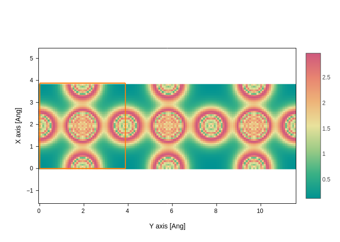
Visualizing supercells
Visualizing grid supercells is as easy as using the nsc setting. If we want to repeat our grid visualization along the second axis 3 times, we just do:
[21]:
plot.update_inputs(axes="yx", nsc=[1, 3, 1], z_range=[1.7, 1.9]).show("png")
We hope you enjoyed what you learned!